by Haris Vekris
When for over 20 years you rummage around cellars, convenience stores, and souvenir shops looking for small ouzo bottles for your collection; when you take your finds and photograph them, record them, classify them and, in recent years, post them on your website, you’ve seen it all: aesthetically offensive, transparent bottles with the gods of Olympus stamped on them; penis-shaped 50-700ml bottles; sad, glass figures miserable in their tsolias costumes; and a host of other kitsch labels and bottles containing ouzo unfit for human consumption. They’re all examples of what to avoid. Their existence gives tourists the wrong impression as to what the phrase “the Greeks’ national drink” really means.
Thankfully, enter the cases contrasting that phenomenon. Those are the cases of ouzo bottle designs brimming with creativity, passion, and remarkable aesthetics. Those are the cases which elevate ouzo to the pedestal it deserves: a container which is as outstanding as the ouzo it holds within. The case of “Hērōs” ouzo is one of the examples of ouzo packaging designs which we need to get to know better so that we can become even more discerning when it comes to design involving ouzo. With no more ado, tsou.gr presents the ouzo “Hērōs” as conceptualized by its S & Team.
The story
Once upon a time Nikos Nikolaou, owner of Nikolaou Winery, based at Aliveri, Evia, visited S & Team offices to discuss his plans to launch a new ouzo brand. As their discussion progressed it became clear that the issue was to target tourists with a taste for design by communicating Greek values through naming and packaging.
The name
The naming research was focused around English words of Greek origin. The idea was to find a name that would be understandable by foreigners and express values which are intrinsic in Greek culture. The word “hērōs” was chosen for all the reasons mentioned above. It is a word with significance to Greeks that also makes sense to tourists, while its spelling with its accent marks gives a hint of its Greek roots (Greek word “ ἥρως”).The name also pays tribute to Greek fisherman, the personification of everyday hero, who struggles above the waves and weather conditions to pull up his daily catch. Summer and ouzo just wouldn’t taste the same without him and his catch.
The packaging
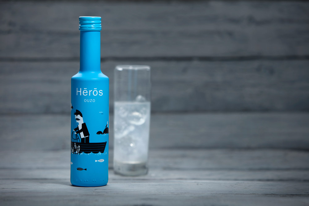
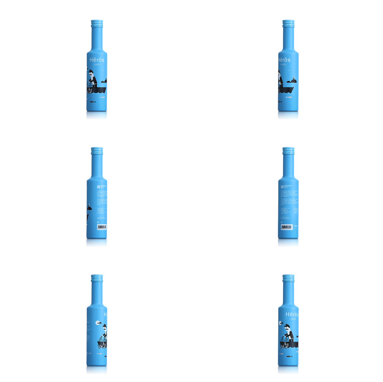
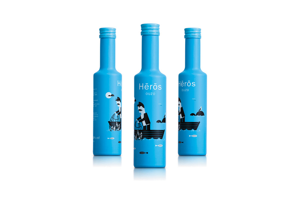
It was clear in their mind that the packaging was not geared towards tourists interested in Greek folklore culture. So a realistic portrayal of Greek fishermen was definitely not an option. Their customer’s persona, as they have defined it together with Nikolaou Winery, was the sophisticated traveler, who apparently wouldn’t get a Greek column ouzo bottle. So an illustrated fisherman in a flat geometric style was created. The light-blue coating of the bottle represents the color of the sea that engulfs Greece. At the back of the bottle is the story behind the name ‘hērōs’ and further information regarding production and alcohol percentage as well as the product’s barcode, which was designed to look like waves to match the entire concept.


